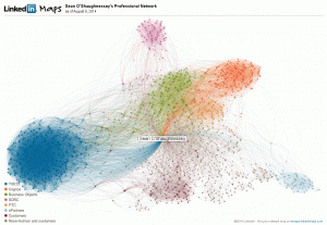
LinkedIn maps are a cool way to visualize big data
LinkedIn Maps are a great example of using Big Data processing tools to create a meaningful representation of data. I have labeled my largest clouds. The largest clouds were places that I worked the longest. Also it is interesting that the customer dots tend to be located in the middle since they tend to have connections to a wide variety of software companies. Of course, my alma mater, Rose-Hulman, tends to be interspersed with customers for the same reason.
It is unfortunate that LinkedIn is turning off LinkedIn Maps. Hopefully, they will replace it with something just as cool. From their website:
Sometimes we have to retire tools we love so we can focus our attention and resources on creating even better experiences for our members. We’re currently looking at new ways to help you visualize and gain insights from your professional network. That’s why we’re discontinuing InMaps as of September 1, 2014.
You can continue to download a visual map of your professional network until that date.
